Designing a Digital PR Campaign Landing Page
The design decisions that determine whether a journalist links to your campaign page or just screenshots the headline and moves on.
A campaign can have a great angle, solid data, and a well-written pitch, and still underperform because the landing page gives journalists nothing worth linking to. The page is the asset being cited — it needs to work harder than a typical marketing page.
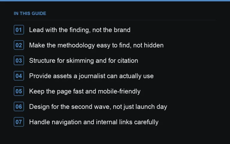
Lead with the finding, not the brand
A journalist arriving from a pitch email wants to confirm the headline claim within seconds. Put the key statistic or finding above the fold, in plain text, before any brand messaging or navigation clutter. Pages that open with a company mission statement before the data lose visitors who assume the story isn’t there.
Make the methodology easy to find, not hidden
A visible, short methodology section — sources, sample size, date range, weighting — builds the credibility a skeptical journalist or editor needs before running the story. Burying this in a downloadable PDF or a separate page adds friction that costs you coverage. Link out to a fuller methodology note if needed, but summarise the essentials on the page itself.
Structure for skimming and for citation
Journalists skim; they don’t read a landing page top to bottom before deciding to cover it. Use clear subheadings for each key finding, and where the campaign is a ranking or index (see https://successtoroad.com/blog/index-and-ranking-campaigns/), put the table itself near the top rather than after several paragraphs of preamble.
Provide assets a journalist can actually use
A page with only an interactive chart that can’t be screenshot cleanly is a page journalists work around rather than with. Offer:
- A static, high-resolution image version of the key chart or map.
- A short, quotable summary sentence for each major finding.
- A clearly labelled contact for follow-up questions.
This connects directly to the practices in https://successtoroad.com/blog/visual-assets-for-journalists/.
Keep the page fast and mobile-friendly
A page that takes several seconds to load or breaks on mobile loses journalists who are often checking a pitch quickly between other tasks. Compress images, avoid heavyweight interactive libraries where a simpler static chart would do, and test the page on a phone before sending a single pitch email.
Design for the second wave, not just launch day
Plan for the page to keep earning links after the initial press cycle — through search, through resource-page curation, or through a later https://successtoroad.com/blog/follow-up-outreach-waves/. That means the page needs to stand alone months later without referencing “this week’s” data in a way that dates badly, unless it’s explicitly framed as an https://successtoroad.com/blog/evergreen-vs-one-off-campaigns/ asset you intend to update.
Handle navigation and internal links carefully
A campaign page cluttered with the site’s full standard navigation, sidebar promotions, and unrelated internal links distracts from the finding and makes the page feel like a marketing asset rather than a piece of research. A simplified layout, with a light-touch link back to the main site and clear source attribution, keeps the focus on the data while still letting an interested reader find their way to the rest of your site.
Write the page copy as if it will be quoted directly
Journalists frequently lift a sentence or two directly from a source page into their own article. Write two or three sentences per section that could stand alone as a quote, complete and unambiguous without the surrounding context. This is a small writing discipline that measurably increases how often your exact phrasing ends up, credited, in the coverage.
Include a clear contact point for follow-up questions
A named contact, or at minimum a monitored inbox, clearly displayed on the page removes a small but real barrier to coverage. A journalist with a quick clarifying question who can’t find who to ask will sometimes simply drop the story rather than chase down contact details through a generic company inquiry form.
Plan the page’s lifecycle before launch
Decide upfront whether the page will stay live indefinitely, get folded into a broader resource later, or eventually redirect somewhere else. A page that quietly disappears or breaks a few months after coverage runs turns every link pointing to it into a dead link, undermining exactly the value the campaign was built to earn in the first place.
Check the page renders correctly across common browsers
A page tested only in the browser the design team happens to use can render subtly differently elsewhere, particularly for older or less common browser versions still used by some newsroom computers. A quick cross-browser check before launch catches layout issues that would otherwise only surface once a journalist reports the page looks broken on their end.
Testing on a genuinely low-spec device, not just a fast development machine, gives a more realistic sense of how the page performs for the average visitor, and it’s often the single check that reveals a heavier chart library is quietly slowing everything else down.
Where to go next
Pair page design decisions with your https://successtoroad.com/blog/headline-writing-for-campaigns/ and plan measurement before launch — see https://successtoroad.com/blog/measuring-campaign-links-and-coverage/. When you’re ready to extend reach beyond organic pickup, https://successtoroad.com/marketplace/ offers publishers across most niches for supporting placements.
Frequently asked questions
Should the landing page live on our main domain or a microsite?
A page on your main domain generally passes on SEO value more directly and is easier to maintain long-term. Microsites can work for very large, ongoing campaign brands but add hosting and upkeep overhead.
How much text should be on a campaign landing page?
Enough to explain the finding and methodology clearly, but structured so a skimming journalist gets the key point in the first few lines. Long unbroken paragraphs of context should come after the headline data, not before it.
Do we need an interactive element on every campaign page?
No. A well-designed static page with a clear chart and table often outperforms an interactive one that's slow to load or awkward for journalists to reference in an article.
What's the most common landing page mistake in digital PR?
Putting the methodology or data behind a click, form fill, or download. Anything that adds friction between a journalist arriving and seeing the actual finding measurably reduces coverage.
Put it into practice
Filter 54,483 websites by DR, traffic, niche and price, and order with escrow — you pay only after the link is live.
Browse the marketplace